Hi all!
This blog has moved to http://www.andrearubash.com/blog/. See you there!
Andrea
Thursday, February 19, 2009
Friday, February 13, 2009
Photoshop Copyright Bar Action
This is a copyright banner action. It's designed to run on 300dpi web sized images and the copyright PSD should be around 95px high.
Download the copyright.psd file to your c: drive and edit it with your own information, logo, etc. This file must be placed in your c: drive in order for the action to work. Mac users will need to re-record the place command.
If you want to batch it, add a flatten command to the end of the action.
If your web-sized images are 72dpi, you just have to make the copyright.psd 72dpi, too.
This is what the action does:

Here are the associated files:
Copyright Bar Action
copyright.psd to be placed in the c: drive
Download the copyright.psd file to your c: drive and edit it with your own information, logo, etc. This file must be placed in your c: drive in order for the action to work. Mac users will need to re-record the place command.
If you want to batch it, add a flatten command to the end of the action.
If your web-sized images are 72dpi, you just have to make the copyright.psd 72dpi, too.
This is what the action does:
Here are the associated files:
Copyright Bar Action
copyright.psd to be placed in the c: drive
Saturday, November 15, 2008
Super cool!
It came, it came!! The new mini card frame from moo.com It was a bit of a pain to put together. The pieces fit together like a puzzle, but they aren't perfect, so when you snap the last one into place, another one pops out, then you get that one back in and another one pops up. It was comical. I finally got it figured out with the help of a couple heavy jar candles. There is no adhesive or slot on the mini frames, so the images most definitely will shift if they are not affixed to something eventually (either the frame itself or the mini frame pieces).
The end result is too cool to stay mad about the somewhat poor implementation. I love the Mac monitor look. The quality of the printing seems a little different this time around, heavier is what I'd call it... more saturated. The quality of the cards is still top notch.
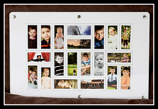
And for good measure, a shot of the rest of the cards in my order. Isn't that just nifty?
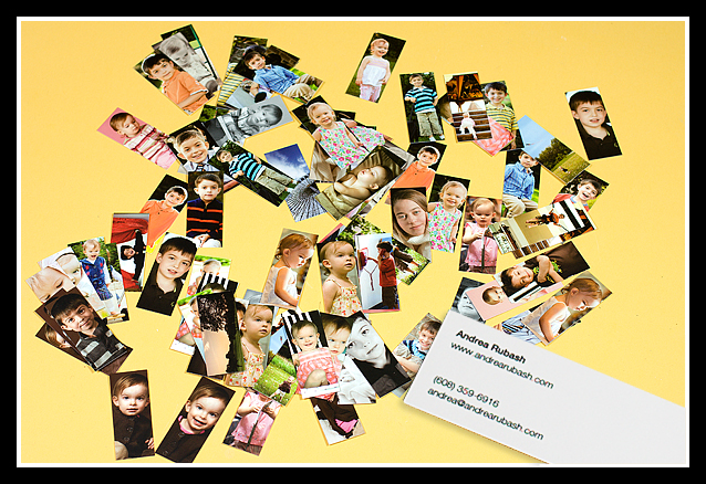
The end result is too cool to stay mad about the somewhat poor implementation. I love the Mac monitor look. The quality of the printing seems a little different this time around, heavier is what I'd call it... more saturated. The quality of the cards is still top notch.
And for good measure, a shot of the rest of the cards in my order. Isn't that just nifty?
Thursday, November 6, 2008
Name Collage Photoshop Tutorial
This tutorial will help you create a name collage. All images have larger counterparts. Click the thumbnails to see the images larger. Note that you may also have to click them again once they've opened in a new window to zoom in on them more.
I chose a 20x10 canvas because it's a frame size I've seen in stores. You can choose any size, but it's probably a good idea to stay around 240-300dpi if you intend to print.
Here's a sample of how your finished collage might look:

The first step is choosing your font and setting up each letter on a separate layer. The font I chose is called "Boris Black Bloxx" but any chunky font will work. Start by working in black so you can easily see the letters and arrange them:

Next, select all of your letter layers and go to Layer --> Rasterize --> Type. Once you do this, you can no longer edit your letters as text so make sure they are just how you want them before you do this step. You will be able to work with them as if they are images instead of text.

Next, select a layer and use Ctrl-i to invert the black letter into a white letter. Do this separately for each of your letter layers. When you've done that, your image will look like this:

Next, select the layer of the first letter you'd like to work with (I highlighted the B layer). Then open the image you'd like to use, tap the 'v' key to select the move tool, then drag the image to your collage canvas. The image will appear on the layer directly above the letter.

Now, move your mouse cursor so that it is situated right on the line between the letter layer and the image layer. Hold down your 'alt' key and you'll notice a double circular cursor with an arrow. Click right on the line while that cursor is on the screen to create a clipping mask (your letter layer then becomes a mask for that image, showing only what is in the white area).

You'll continue this process for each letter. Make sure you select the letter you want to work with, then open the image you want to use to fill that letter and drag the image directly on top of it. Hold down the 'alt' key and click right between the 2 layers with the image above the letter layer. When you've finished all the letters, your layers palette will look like this:

Now you can be creative. First, add a background layer. I prefer white, so that's what I used. You can use any color. Just add a layer all the way at the bottom and use the paint bucket to fill it with your color of choice.
Select a letter layer to add effects to the letter. You can access the effects panel by double clicking the layer. I used a stroke and a drop shadow. Once you have the effect the way you want it, right click the layer and select "Copy Layer Style" to copy the effect, then select the next letter and right click again, this time selecting "Paste Layer Style" to paste the same effect on each letter layer. Remember to do this on the letter layer, not on the image layer.

When I finished with that, I created another text layer for a name. I also applied effects to the name. I also created additional layers where I used a free brush I downloaded from one of the many PS brush sites (google) to both sides for a little extra decoration.

That's it! The finished collage is ready to be printed and framed at 20x10! Remember, you can click the thumbnail to see the image larger. :)

Monday, November 3, 2008
Hey, look at that!
I had almost forgotten about being asked by moo.com to use my mini cards in their promotion of their new mini card frames. I won't lie, it does give me a bit of a warm fuzzy to see my stuff popping up in places like moo.com and Midwest Living Magazine. It is certainly validating to know that others think it's worth showcasing!
I highlighted the places my images appear in red and used some arrows on the thumbnail. Click the thumb to get a better look at the screenshot. And if you want to order some moo cards, go to http://www.moo.com! They really are great quality and great fun to hand out!

Update! I just noticed they're on the front page slideshow nice and big, too!

Friday, October 31, 2008
Brandon's Photo in Midwest Living Magazine!
I know some professional photographers are going to be angry about the content of this blog post, but hopefully not too many of them bother to read my little blog. Yes, I gave away an image to a publication for free. Obviously this lights a fire under pros who think they should be compensated for every shutter press. Ehhh... sorry? When it's your kid and a magazine with a circulation of one million, I think you'd opt for the bragging rights. :)
Back in July the kids and I visited a very cool indoor play area in Chicago -- Dayfrog! If you're ever in Chicago, check it out with your kids. We enjoyed it so much that we spent two days of our visit there. While I was there I took some snapshots of the kids (shocking!).
The images weren't great quality, just family snaps in low light, but I had a couple that were OK. A while back the owner e-mailed and asked if I would send him something for an upcoming article. Of course!
Here's a photo of Brandon that accompanies their article in the December issue of Midwest Living Magazine! How cool is that? I'm supposed to receive a copy of the magazine soon. Brandon is trying not to let it go to his head. ;)
Click the photo to see the whole page.

Thursday, October 16, 2008
Photoshop Actions
I've ended up with a small selection of actions that I've created by request or for my own use. I thought it would be good to have a designated place to collect them. These are my basic actions for color workflow and web finishing. I've also included two brightness/contrast actions that I thought might be helpful for contrasty scenes.
Basic Color Workflow -- Sets up adjustment layers for all of the main adjustments with the proper blending modes selected. Arbitrary starting values are selected, but each layer should be adjusted for the actual image.
Selectively Brighten -- Brightens midtones and shadows. This can be run right after the main color workflow action to instantly brighten and smooth the image. You can also run this 2 or more times to achieve a brighter result.
Even out Shadows -- Pulls down the brightness on the highlights and pushes up brightness on midtones and shadows. This evens out the tones in contrasty scenes. This can also be used after the main color workflow action, but probably should not be combined with the selective brightening action above.
Double Drop Shadow Frame (portrait and landscape) -- These add a fancy double shadowed border to your image. This action also resizes and sharpens your image for web. Choose the appropriate action for the orientation of your photo if uniformity is desired. Click here for a sample.
Basic web finishing(portrait and landscape) -- These add a basic black border with white keyline. This action also resizes and sharpens your image for web. Choose the appropriate action for the orientation of your photo if uniformity is desired. Click here for a sample.
Sharpen for Web only -- Just what you'd think -- flattens and sharpens your web-sized image without resizing or adding a border.
These actions are available for download here:
http://www.andrearubash.com/POTN/Andrea's Actions.atn
Subscribe to:
Posts (Atom)